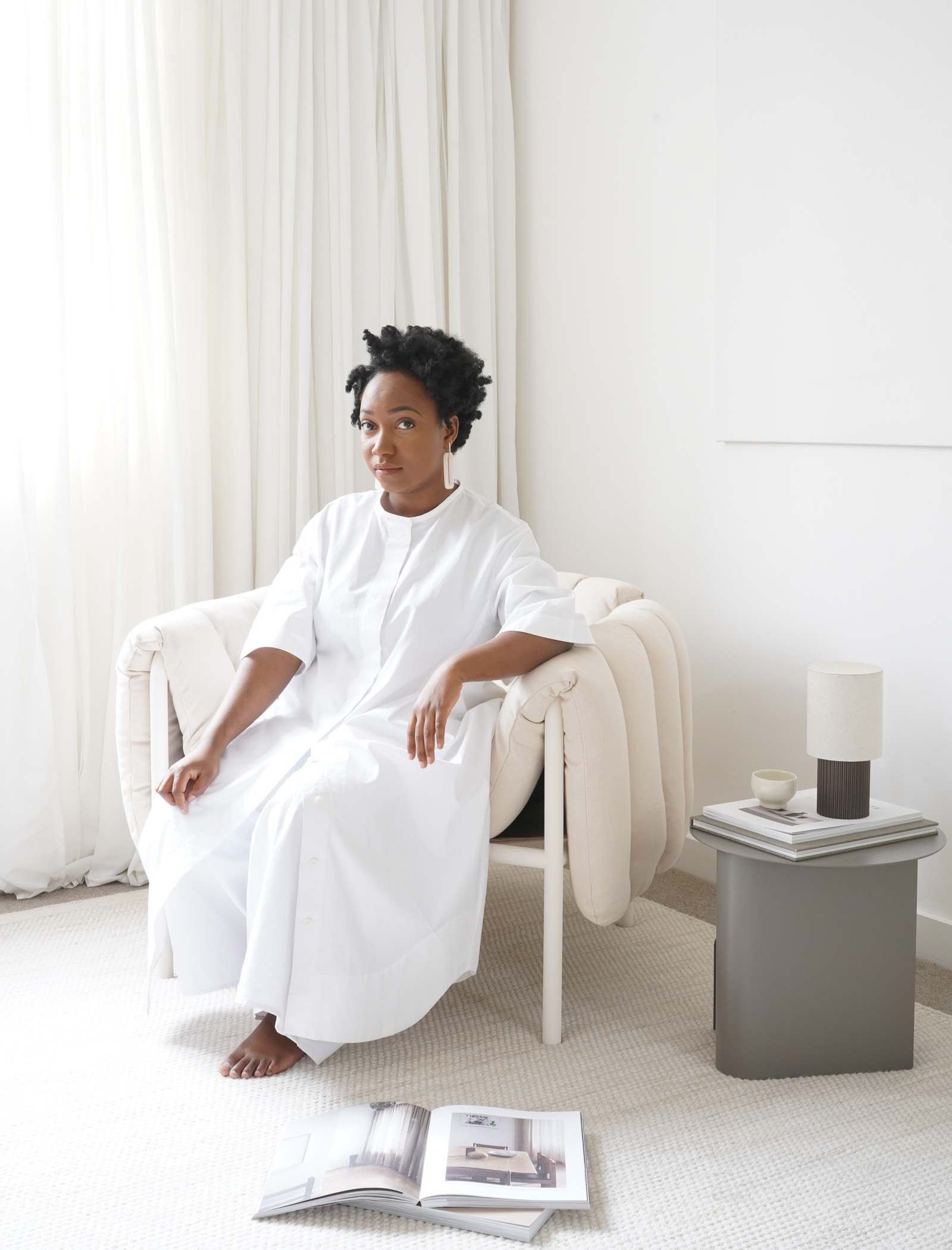
Product stylist and photographer Hali Mason’s home has a serene atmosphere, sharing certain qualities with a beautiful showroom or gallery. Situated in the leafy suburb of Didsbury in Manchester, the house features a collection of high-quality design pieces. The master bedroom, living and dining spaces utilise a mixture of mood lighting, natural materials and well-placed objects to create a calm and minimalistic yet functional environment.
Below, Hali takes us through some of her favourite rooms in her home, giving insight into how she and her family use and enjoy each space and the objects they’ve chosen to include.
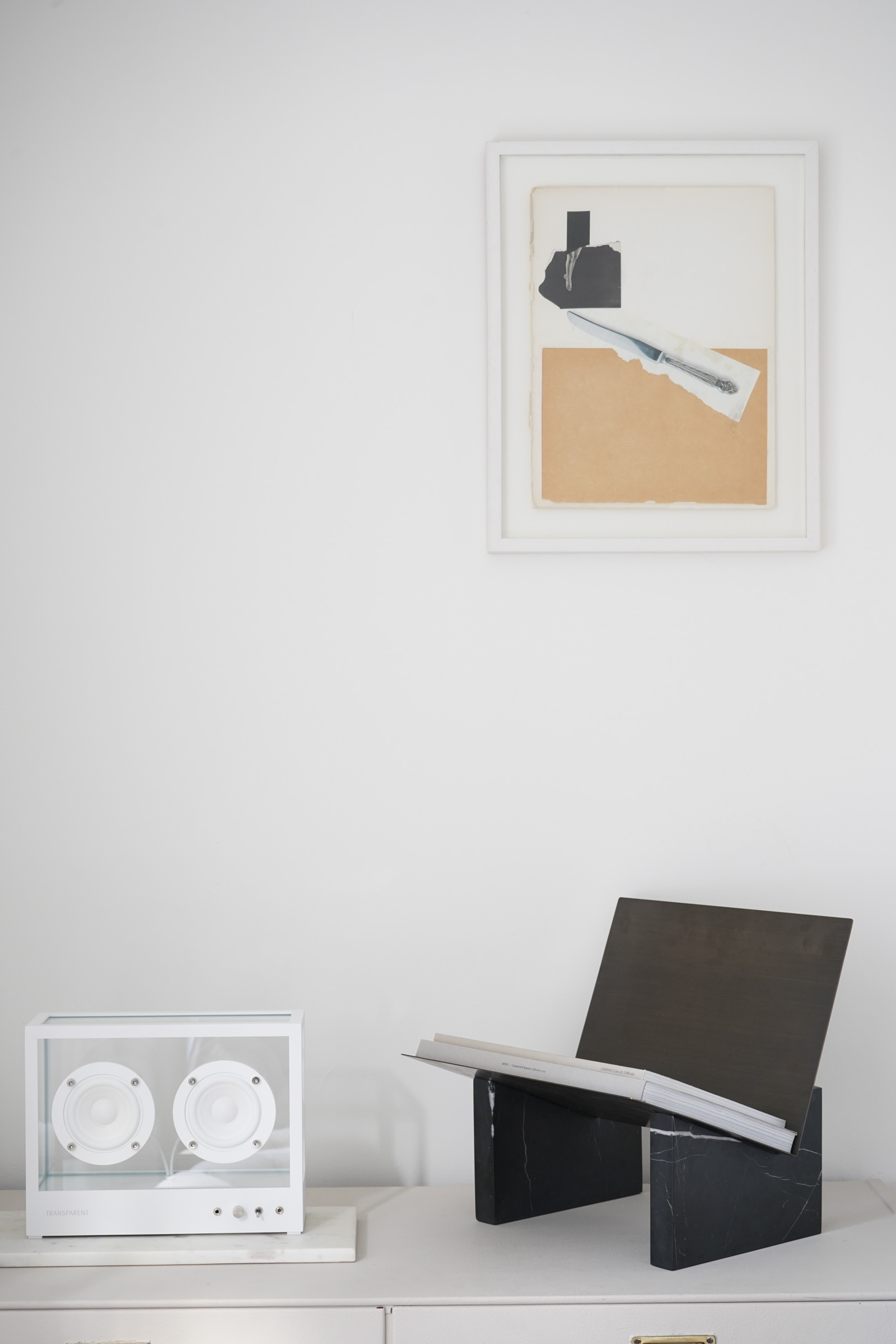
Dining Room
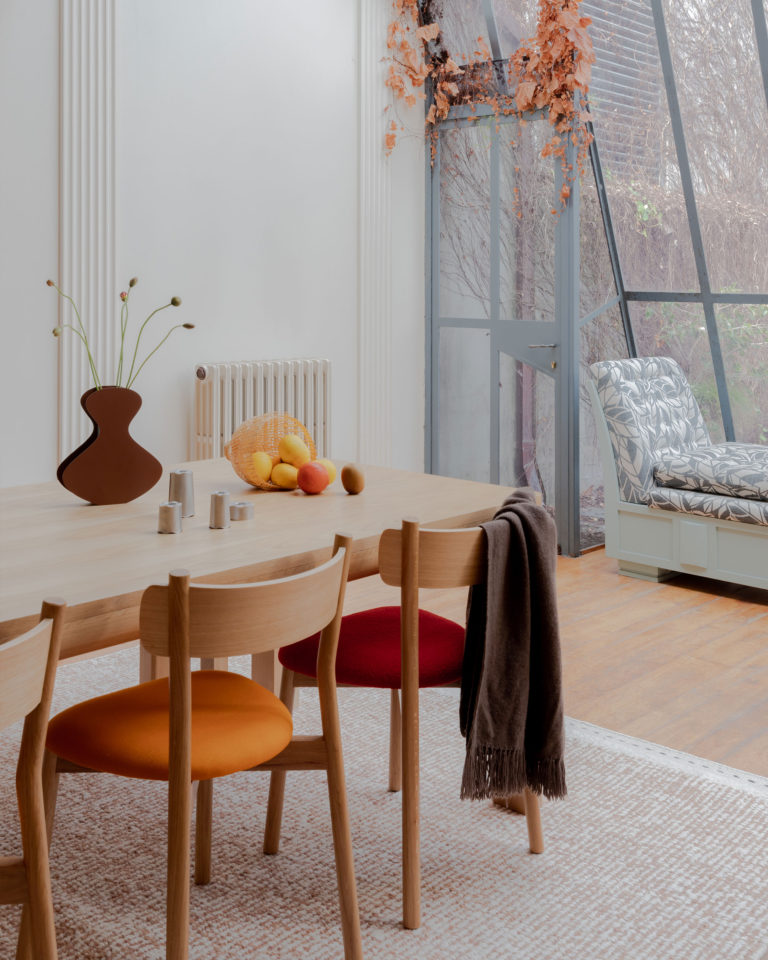
We eat breakfast, lunch and dinner in this room, it’s a place for togetherness and happy conversation. This room receives a generous amount of morning light but is relatively compact. I always try to select pieces that will enhance my experience of a space.
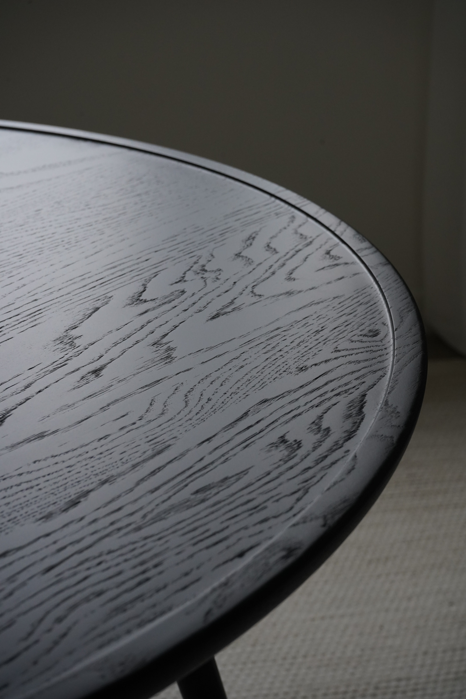
The Accent Dining Table from Mater is perfect in this room as the circular shape encourages movement rather than creating a barrier. This table is designed by Space Copenhagen, a favourite duo of mine. This new black edition has incredible grain detail and unique design characteristics.
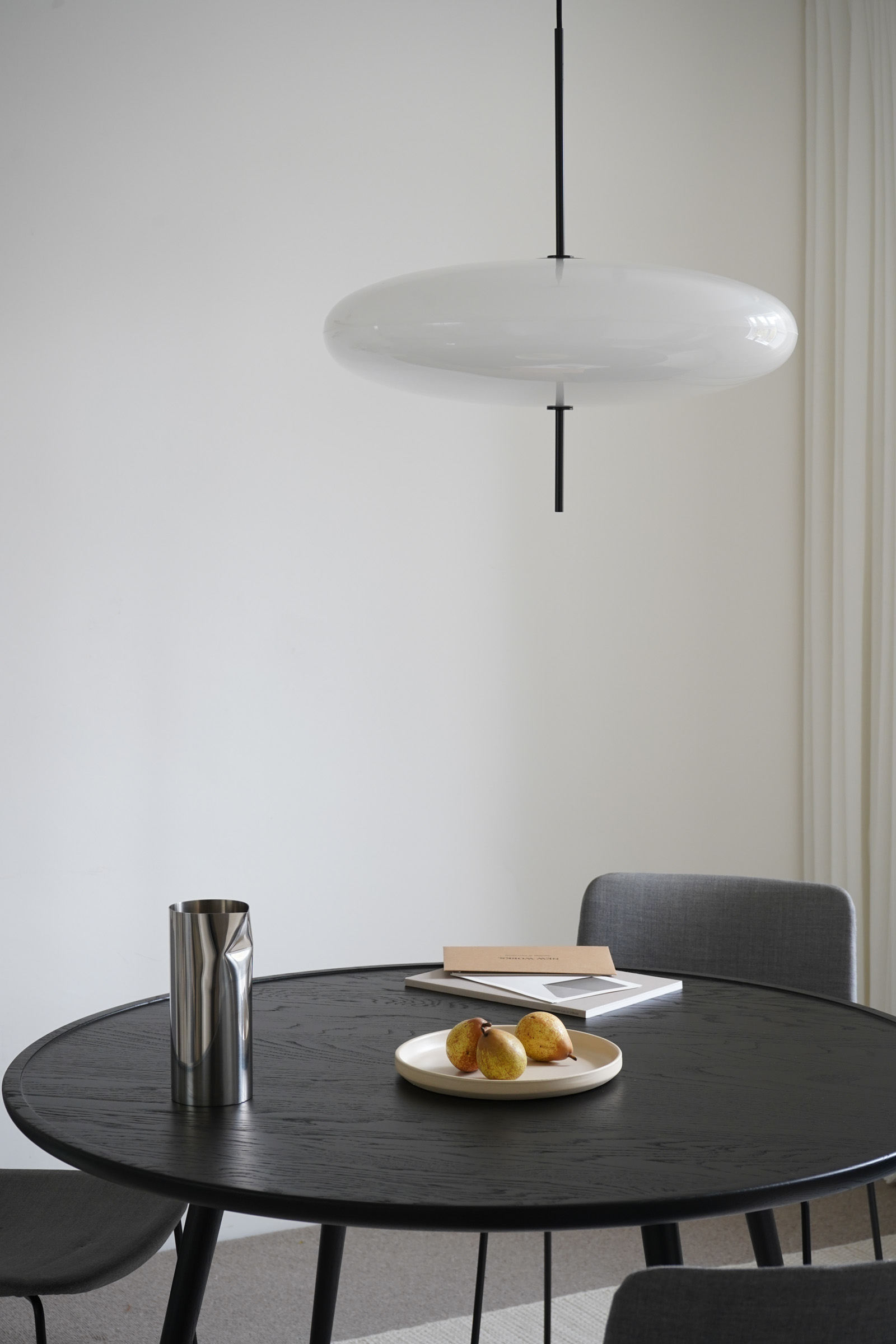
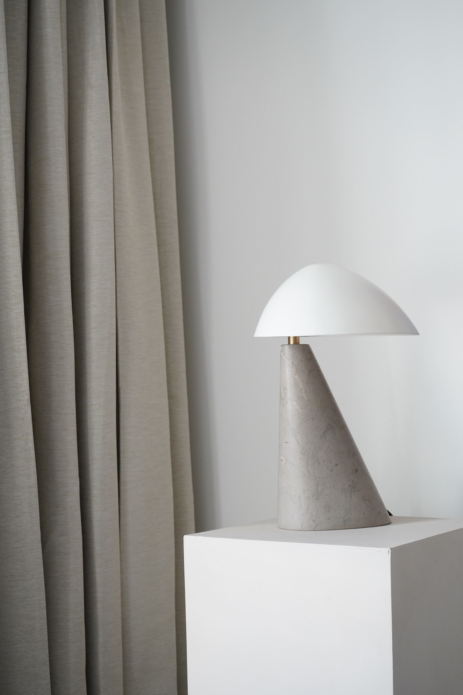
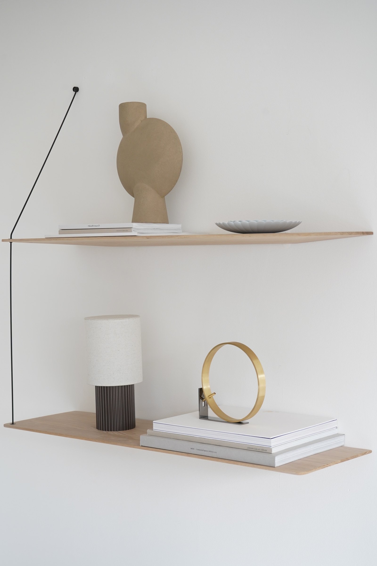
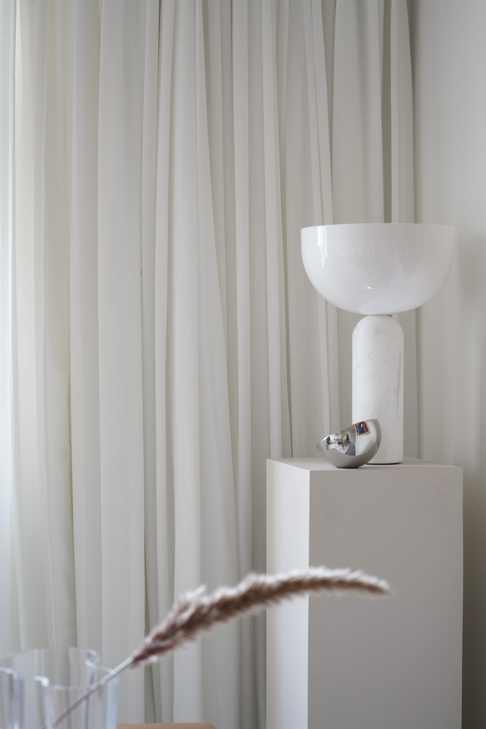
The Model 2065 suspension lamp from Astep is a design from 1950. I am drawn to its balance between eye-catching and clean. Having mood lighting is important for me, and to retain as much floor space as possible, I use a WOUD Stedge shelf to house a portable Manhattan lamp from &Tradition—also designed by Space Copenhagen. I also have a New Works Kizu Lamp on a thin pedestal positioned in the corner of the room.
Living Room
The living space is a chill zone where I do my photo editing while my husband reads and our son plays. We are music fans and collect vinyl records, so this room constantly has light jazz playing for relaxing and afrobeats for dancing!
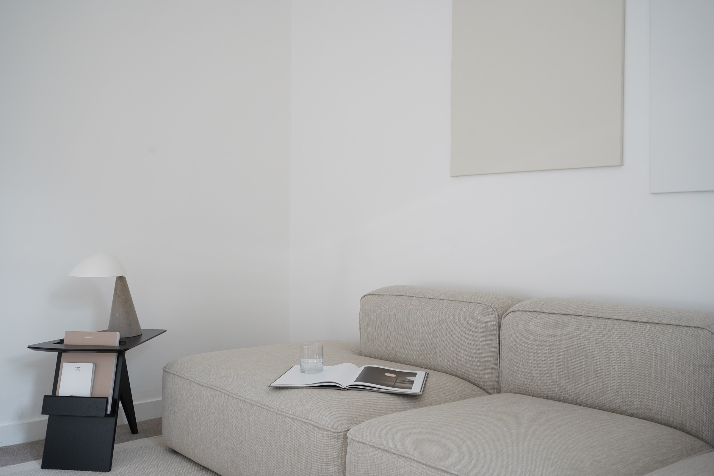
Our living area was actually previously our dining room. We prioritised a larger table for entertaining and had a smaller sofa and tv area in what is now the dining room. We swapped the spaces when we got rid of the television and it was the best decision for us. It meant we were able to have a larger sofa from MAKE Nordic which has been a game-changer.
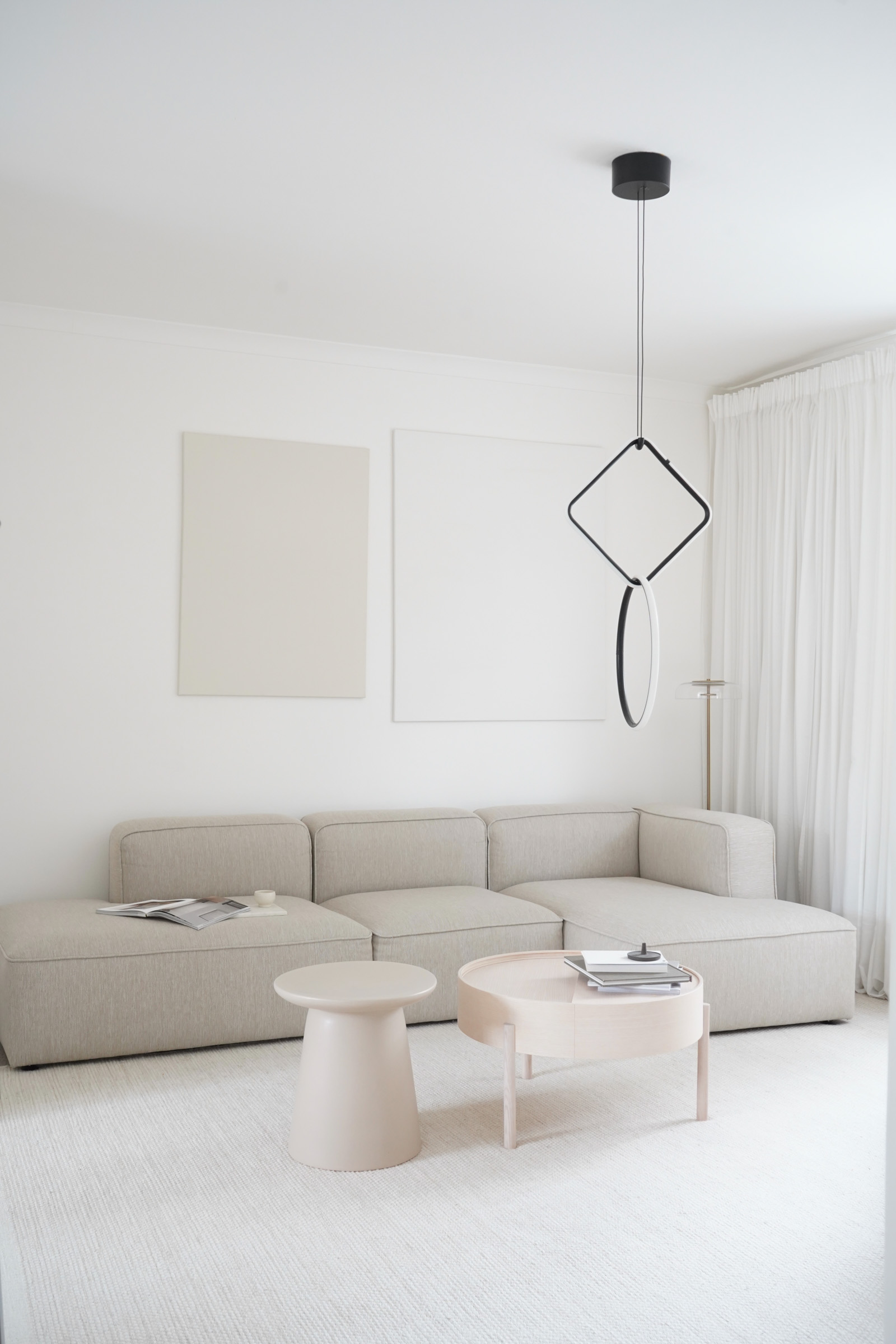
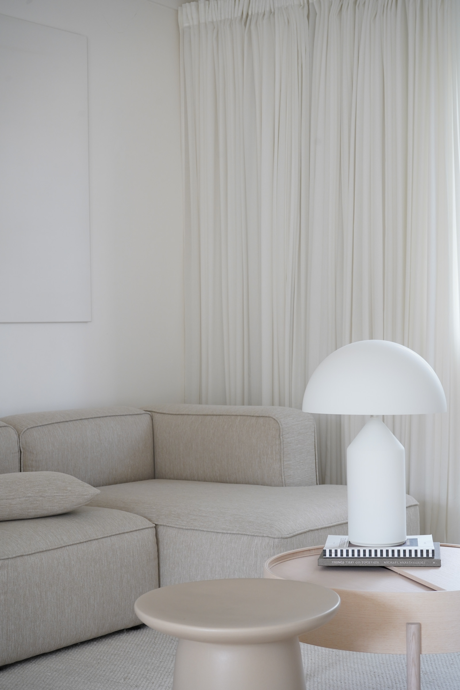
One of my favourite things about the space is that it looks out onto our little garden which is full of plants and trees, so you are always met with a bright green view. The Flos Arrangements pendant light is one of my favourite designs by one of my favourite minimalist designers Michael Anastassiades. I never tire of admiring it. Again, I utilise different levels of mood lighting positioned around the room which is so important for a relaxing atmosphere.
Master Bedroom
The master bedroom is definitely the most tranquil room in the house. This is a no-technology zone. It looks out onto treetops and the sheer curtains allow the morning light to naturally envelop the room—a great way to wake up.
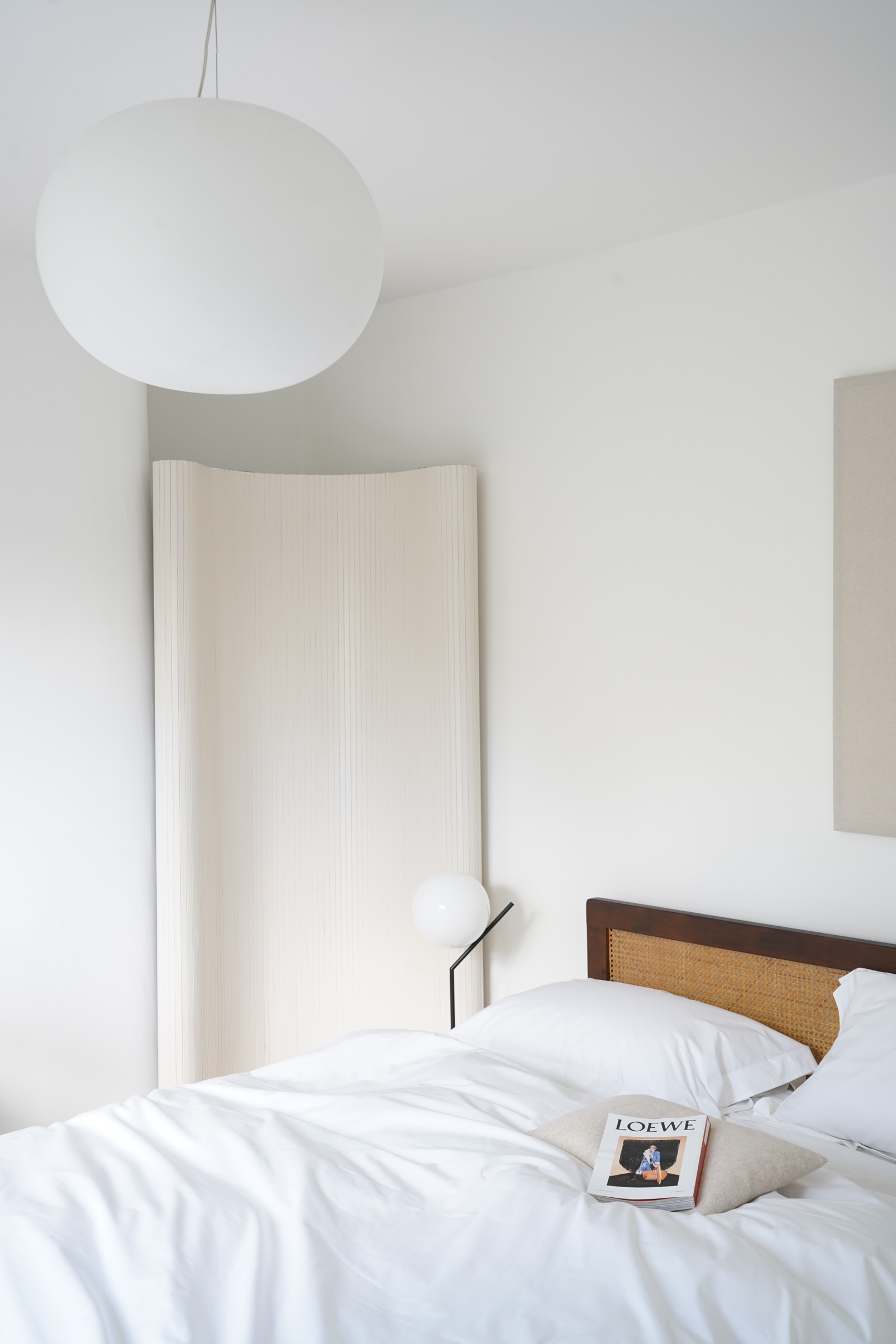
I love the use of natural materials, so I found a vintage wooden framed rattan bed which gives the space some warmth. I use a printed wooden screen to reflect light from an otherwise shadowed corner alcove which really brightens the space.
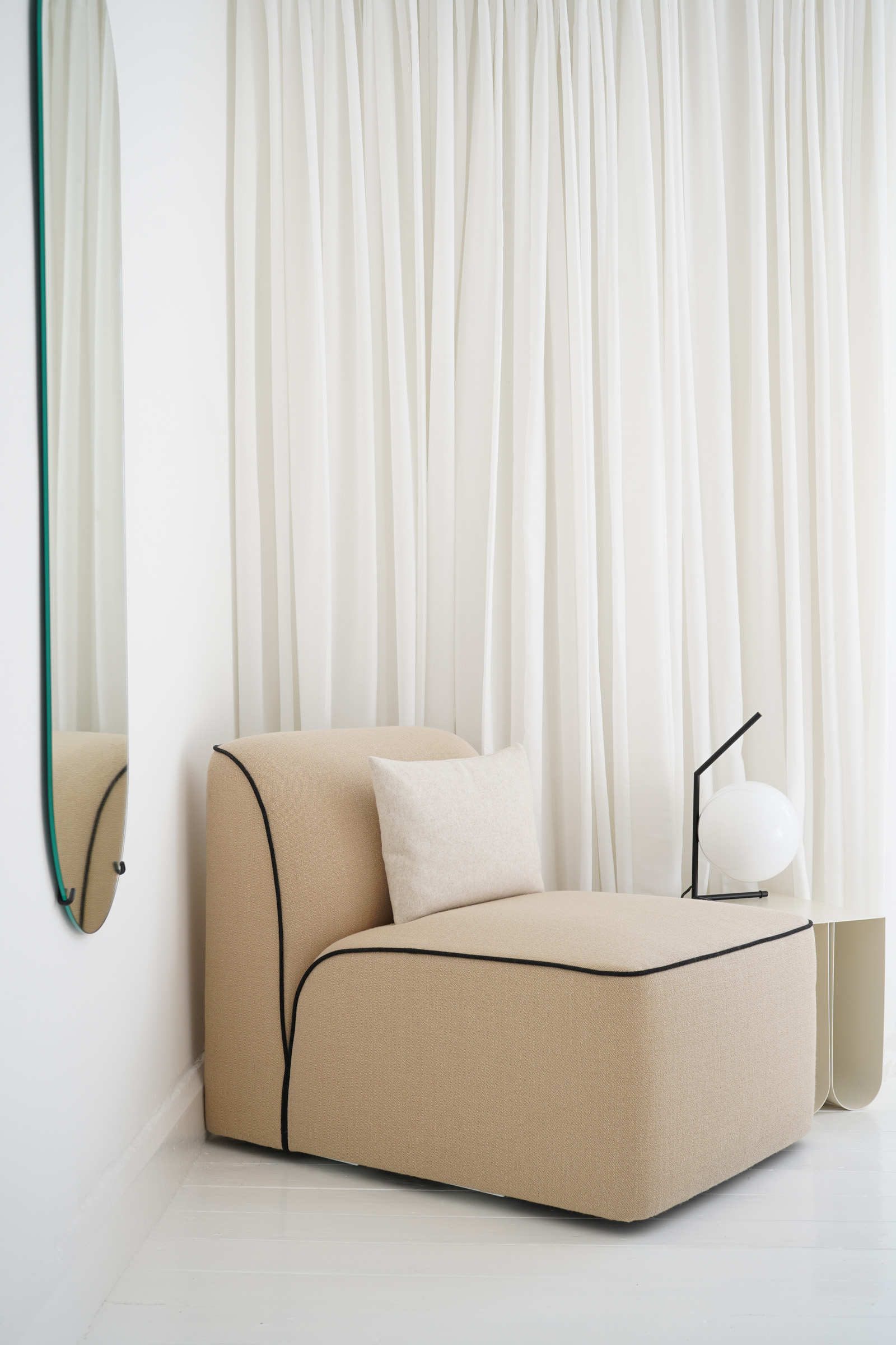
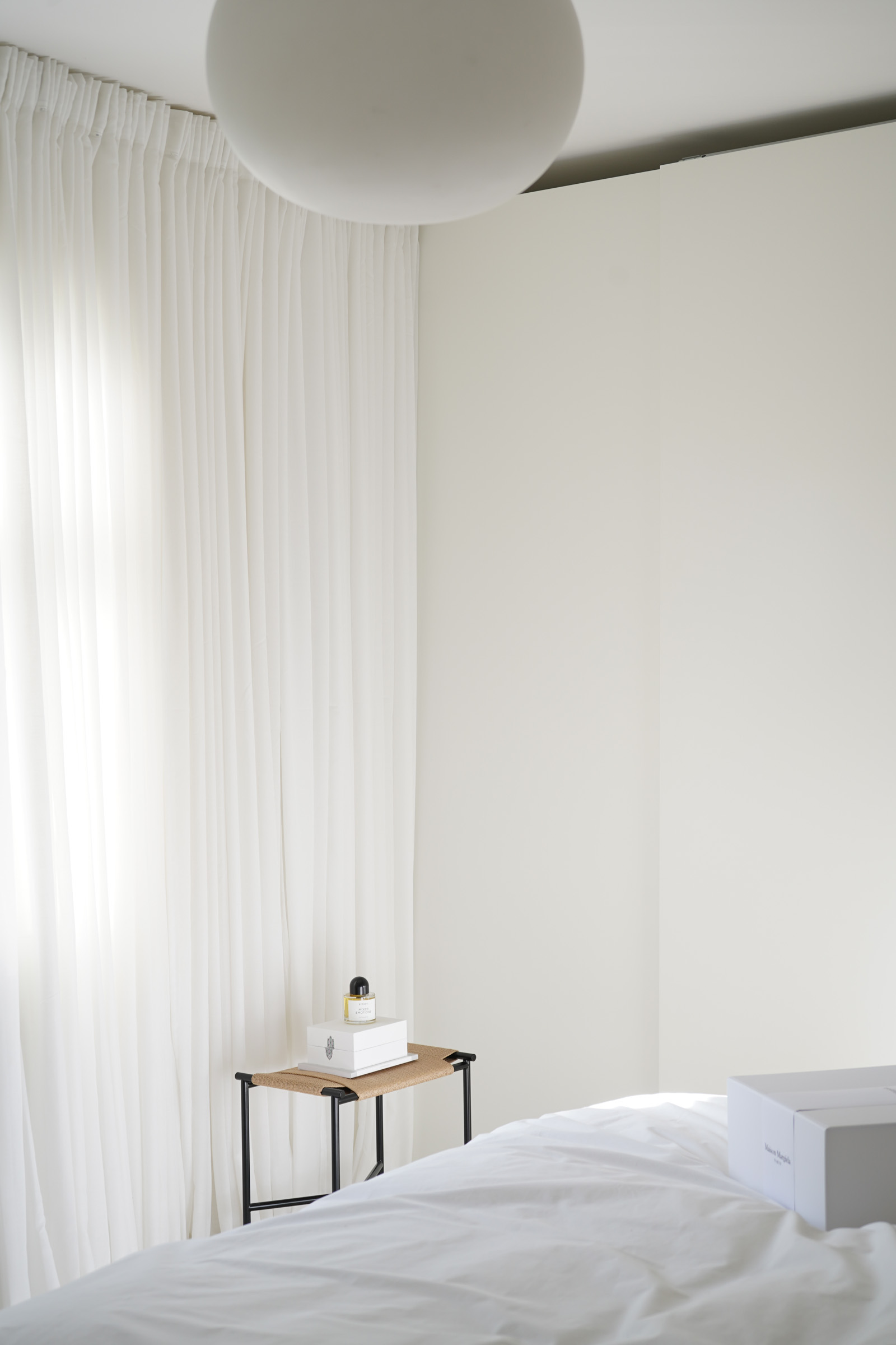
I always like to have seating in a bedroom and so along with a useful Vent stool by Skagerak, I have a super comfortable reading corner using a Flora sofa module from WOUD and a Curve side table by Kristina Dam Studio. The table lamps are IC T1 Tall and Low—again designed by Michael Anastassiades for Flos. The globe shades emit a beautifully soft light and are dimmable—the perfect bedroom lamps.
